
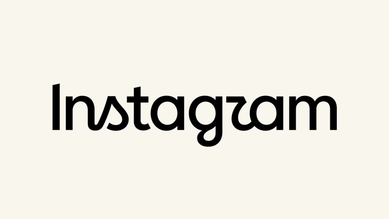
Instagram updated theirs on Thursday logotypethat is, the written name that appears at the top of the application, for the first time in ten years. The new font recovers italic-style curves on the letters s, r And gand the immediate collective reaction was to read about it Instagzam: The shape of the r resembles a z enough to make the switch automatic. It was announced Adam Mosseriresponsible for Instagram, with a post published on both Instagram and Threads.
The app icon remains the same as before. The square with the fuchsia/magenta/yellow gradient that is on the initial screens has not been touched, and the intervention only concerns the written name, which appears in the application header, in marketing materials and in communications. Meta did not clarify whether a new pictogram will also follow, nor whether other design interventions are planned.
View this post on Instagram
Mosseri justified the operation with the age of the brand: the name at the top of the app hadn’t changed for ten years and for the platform manager it was time to update it. The result, he wrote, is “more modern, with references to the original and to that simplicity and care that have always made Instagram what it is.” The post also made it to Threads, where Mosseri admitted that he wanted to see “what the immediate reactions would be”, and the platform’s design account showed some of the typographic alternatives explored and then discarded.
Cursive curves and readability test
The result is a hybrid between italic and block letters, which appears slightly less readable than its predecessor. The original Instagram logo was itself a calligraphic character, so recovering its curves is an archival gesture, and the real verification will come at the small size, where the curves are the first calligraphic element that can lose detail.
The precedent of 2016
The last time Instagram changed its visual identity was in 2016when the brown camera with the rainbow stripe gave way to the square with the colored gradient. It was not only a decorative modification, since thehe old icon described an app for taking photographs, and by 2016 Instagram had already stopped being primarily that. Abandoning the camera was tantamount to a public admission, and the ensuing protest petered out within a month.
Since then the product has moved much further, between video feed, messaging and commercial showcase, and this time the update touches on the less important portion of the visual identity. Changing the logo costs little in terms of recognisability: it updates on all the contact points that the company controls without asking anyone to relearn something. The icon is instead recognized by color and shape at sizes where the letters cannot even be read, and that recognition is a capital whose replacement cost is probably difficult to size correctly.
Two clues will tell if the operation is larger than that, and they are both verifiable. The first is the icon: if that were to change too it would be a true repositioning, while the logo alone remains a formal tidying up. The second is the diffusion of the new font on the other surfaces of the group, from Threads to Meta AI products up to hardware communication, because a new font that travels throughout the entire family is a systemic element, while if it remained limited to Instagram it would simply be a “refresh”.